In the evolving landscape of data visualization, the traditional box plot is facing increasing scrutiny. While box plots have long been a staple for statisticians and data scientists, there is a growing consensus that they might not be the best tool for effectively communicating data insights to a broader audience. Data visualization is fundamentally about clarity and comprehension, attributes that many experts argue box plots lack when compared to more modern alternatives.
One major criticism of box plots is their lack of intuitive understanding, especially for those who haven’t been formally trained in statistics. The challenge lies in interpreting the components of the box plot – the median, quartiles, and whiskers – which can be unintuitive for a layperson. For a graphic intended to simplify data, the box plot often necessitates additional explanation, creating a barrier to understanding. This raises the question: why complicate something as simple as data visualization?
To address this, various alternatives have been proposed and adopted by data scientists aiming for better visual communication. Violin plots, for example, offer a more comprehensive view of the data’s distribution. Essentially a combination of a box plot and density plot, the violin plot shows the probability density of the data at different values. A link explaining the concept in more detail can be found [here](https://en.wikipedia.org/wiki/Violin_plot). The shape of the violin plot’s ‘body’ can provide a smooth and more visually continuous representation of the data’s distribution.
However, as a commenter pointed out, violin plots come with their own set of challenges. The shape of the violin depends on the bandwidth hyperparameter of the kernel density estimator used inside. The correct bandwidth selection is a classic bias-variance tradeoff problem, introducing yet another level of complexity. That being said, violin plots generally offer a more intuitive visual than box plots, especially for audiences unfamiliar with statistical nuances.
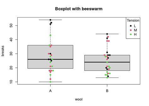
Another compelling alternative is the bee swarm plot, also known as a sina plot. This method plots each data point individually, which can be overlayed with additional elements like mean bars to highlight central tendencies while showing the full data distribution. An interesting read on the use of bee swarm plots can be found [here](https://www.rhoworld.com/i-swarm-you-swarm-we-all-swarm-for-beeswarm-plots-0/). These plots are particularly beneficial when dealing with medium-sized data sets, providing a transparent look at the data distribution while avoiding the pitfalls associated with overly smooth density plots.
For those who strictly prefer summary statistics but find box plots lacking, jittered strip plots offer a modern compromise. These plots use scattered points to visually indicate the distribution of values, making it easier to spot clusters and gaps that might not be visible in a box plot. Although high-density areas can overlap and become challenging to interpret, jittered strip plots generally offer a more accurate portrayal of data trends.
In practice, some data scientists prefer integrating multiple visualization techniques to offer a detailed, multi-faceted view. For instance, combining a box plot with a scatter plot overlay can help mitigate the misrepresentation of data through smoothing while preserving the compact summary that box plots provide. This combination allows viewers to quickly glean median and quartile information while also appreciating the underlying data distribution.
Beyond the technical merits or drawbacks of any given plot, it’s essential to recognize the fundamental goal of data visualization: effective communication. As data scientists, it’s our job to ensure that our visual tools are as clear and informative as possible. This often means selecting the visualization type that best fits the audience’s level of statistical understanding. While box plots remain crucial for certain analytical tasks, alternative methods such as violin plots, bee swarm plots, jittered strip plots, and even histograms should be more frequently considered for communicating data to a broader, less statistically-trained audience. Ultimately, the push for clearer, more intuitive data visualization methods underscores the ongoing evolution and improvement within the field.
Leave a Reply