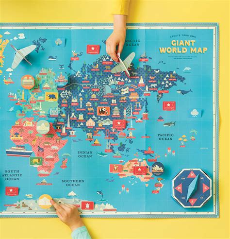
In the era of handheld devices and limited data storage, the quest for efficiency in digital design has led to innovative solutions across various tech niches. One such innovation is the development of the Tiny World Map, an ambitious project aiming to provide a global map in a compact format. However, the endeavor is not without its hurdles, as balancing detail, file size, and user needs has proven to be a meticulous dance. Users from around the world reported varying experiences, highlighting the intricate balance between a map’s usability and the level of detail it maintains. The core challenge lies in the map’s ability to serve as a reliable tool while remaining lightweight and responsive, particularly on less capable devices.
A user highlighted how the map’s simplification process might have gone a bit too far in some instances, such as the exclusion of smaller islands or the inaccurate portrayal of some major cities. These omissions can impair the map’s effectiveness for users requiring precise geographical data. For instance, a traveler looking to navigate the remote landscapes of northern Russia might find themselves staring at an empty screen where tiny villages should be. On the flip side, urban areas might suffer from an overload of data, where not every suburb needs to be marked, thus cluttering the view and potentially causing confusion.
Comments from users suggest a need for a dynamic density control in the mapping algorithm, which could adjust the display of cities and towns based on the surrounding density. Such a solution could enhance the usability of the map in both densely populated urban areas and more sparsely populated regions. Marcosdumay’s suggestion of dividing the mapped area by a constant to determine the appropriate number of elements to display hints at a possible algorithmic approach to refine how data is represented based on the region being viewed.
The discussion also brings to light the technical limitations and considerations that come with creating such a compressed digital product. RetroTechie and others pointed out that increasing detail to include lesser-known or smaller regions could either necessitate dropping out more significant areas or increase the app’s size, which goes against the purpose of having a ‘tiny’ map. Moreover, the idea of a ‘Locate Me’ feature suggests the addition of interactive elements that could improve user engagement without necessarily bulking up the software. This feature could potentially leverage the geolocation capabilities of devices to offer a more personalized mapping experience.
Looking forward, the Tiny World Map developers might also benefit from exploring how adjustments in their data prioritization could better meet user expectations. As one commenter suggested, integrating Wikidata’s QRank, which sorts geographical entities based on their popularity across Wikimedia projects, could help in deciding which areas to display more prominently. However, as other users noted, such measures must be balanced with considerations of informational integrity and fairness, especially in regions where political and geographical recognition can be contentious. The ongoing feedback loop from the community and iterative improvements in design highlight the responsive nature of open-source projects, which adapt over time to better meet the needs of their diverse user base.
Leave a Reply